Complete this quiz and
proceed to the next lesson
Start Quiz

Candlestick chart patterns reveal a wealth of information for the trader. A candle with a long body and little or no wick indicates that there is no indecision about price. During the period that this candle covers, traders would be mostly taking the same side, and prices would be heading in one direction.
Conversely, a short body and long wick on a candlestick chart shows that traders couldn’t make up their minds collectively. Price gyrated around its opening level and after lots of movement wound up virtually unchanged.
In this lesson, we will learn all about candlestick patterns and how whole sequences of candles can form shapes or patterns that suggest both what markets are feeling about a given currency pair, and where price is likely to go in the future.
I've mastered this topic, take me to the next lesson
We strongly recommend you open a free trading account for practice purposes.
Japanese Candlestick Chart Patterns
In order to create a candlestick pattern, a trader must have data that contains open, high, low and close values for each time period he wants to display.
Compared to traditional bar charts, many traders consider candlestick chart patterns more visually appealing and easier to interpret. Each candlestick pattern provides an easy-to-decipher picture of price action. A trader can immediately compare the relationship between the open and close as well as the high and low. The relationship between the open and close is considered vital information and forms the essence of candlesticks patterns. Hollow candlesticks, where the close is greater than the open, indicate buying pressure. Filled candlesticks, where the close is less than the open, indicate selling pressure. Long white candlesticks show strong buying pressure. Long black candlesticks show strong selling pressure.
Upper shadows represent the session high and lower shadows the session low. Candlesticks with short shadows indicate that most of the trading action was confined near the open and close. Candlesticks with long shadows show that prices extended well past the open and close.
Back in our introduction to Japanese candles, we saw how differently shaped candles reflected market sentiment for the duration of the candles. For example:
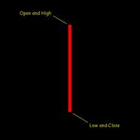
A candle like this one, with a long body and little or no wick means that there was no indecision about price. During the period this candle covers, traders were selling and price was heading lower from the start.
Conversely, a candle like this one indicated that traders couldn’t make up their minds. Price gyrated around its opening level and after lots of movement wound up virtually unchanged.
Similarly, whole sequences of candles can form shapes or patterns that suggest both what markets are feeling about a given currency pair (or other asset) and where price is likely to go in the future.
We can see one type of candlestick chart pattern in figure 3.5, shown below.

In a previous lesson, we mentioned how some of the different candlestick shapes and combination shapes hinted at what traders were thinking and thus how price might move in the near future.
When using chart patterns, it is easy to forecast how price would move at some future date. If it moves lower, we can offer a few reasons why this move could have been predicted based on the information we had up to that point.
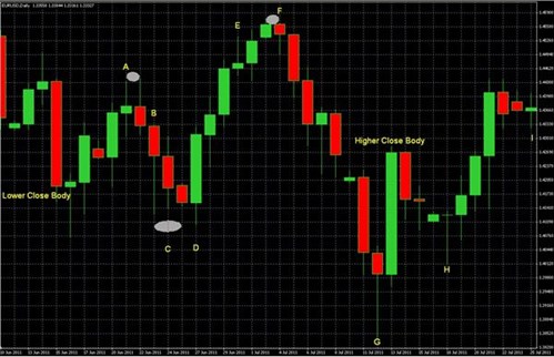
In fact, often the shape of the candle pattern can suggest a coming move downwards. They would form a “bearish head and shoulders pattern,” which is similar to a “W” with a higher center peak that is reminiscent of a head flanked by two shoulders.
When this pattern appears during an uptrend, it often signals that this uptrend is about to reverse.
A full treatment of the different candlestick chart patterns could cover several lessons. We’ll cover these in greater depth later. For now, just know that these patterns exist and are another tool for identifying support / resistance levels and where price is likely to pause or reverse its direction.
This lesson’s video aims to explain:
Follow us on:
![]()
![]()
![]()

We hope you found our site useful and we look forward to helping you again soon!